Regardless of how you use color in you document, web page, PowerPoint, graphic, or anything else, you must ensure that the colors you are using have appropriate color contrast. Ensuring appropriate color contrast means that your material is visible to those with low vision and color deficiencies, not to mention the general public.
Guidelines requires a contrast ratio of 4.5:1 for all standard text. For those of you who do not regularly calculate luminosity by hand, we recommend using a color contrast checker to ensure that your color palate is accessible and compliant. We recommend WebAIM's color contrast checker which we outline below.
Using WebAIM's Color Contrast Checker
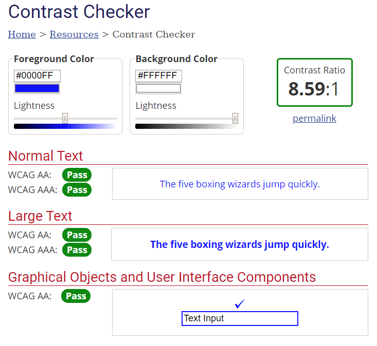
- If you already have colors in mind, you will need to know your colors' RGB, HEX, or HSL values. Otherwise you may experiment with different color combinations on the page.
- Navigate to WebAIM's color contrast checker

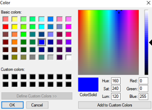
- In the right-hand "Foreground Color" input the HEX value for your color you wish to test if you have it. Then skip to step 5. If you do not know the HEX value for the color you with to test or want to choose from a color picker, click the color box directly below the HEX value form field. This will bring up the "colors" dialogue box.

- In the colors dialogue box, input the RGB or HSL value for the color you wish to test. If you prefer, you can also chose a color from the color picker. When done hit okay.
- Navigate to the "Background Color" box and repeat the process described above by either entering a hex value, or entering RGB or HSL values (or using the color picker) in the "colors" dialogue box.
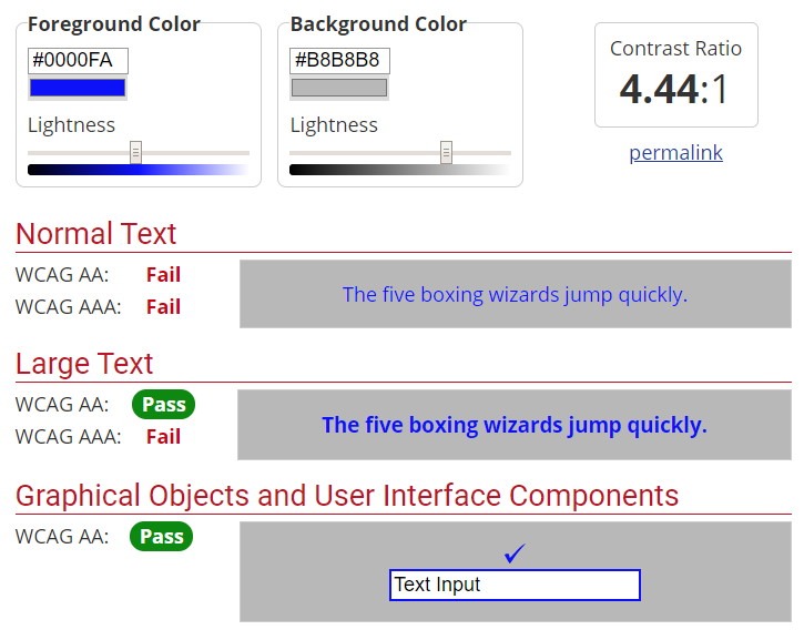
- Once both the foreground and background colors have been input, a contrast ration will be displayed along with information on whether or not the color combination passes accessibility guidelines. We recommend to not use any color combination that does not pass WCAG AA standards under the "Normal Text Heading." In the image below, it is apparent that the two color combination do not pass and should not be used together.

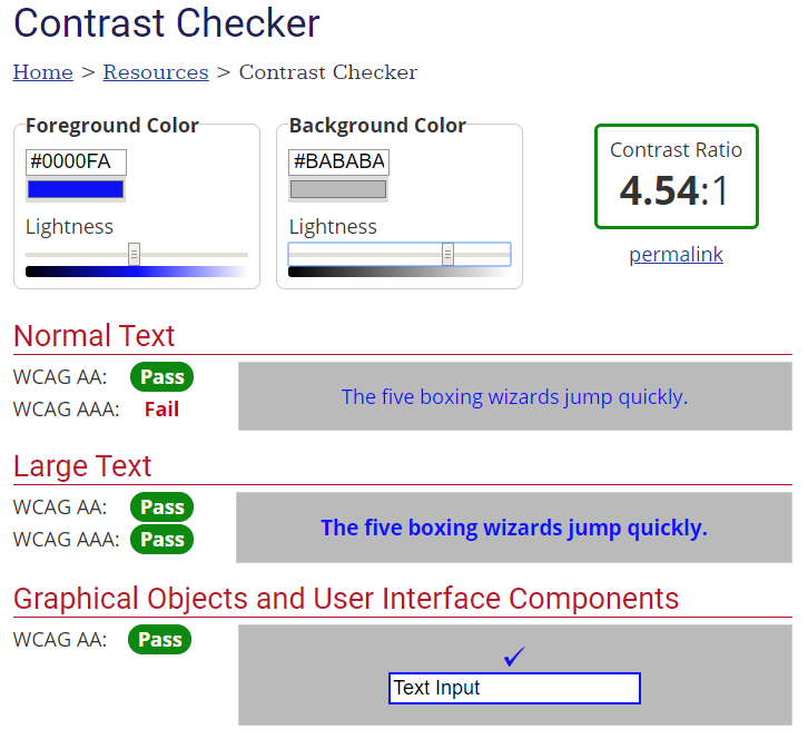
- If your color combination fails, you may wish to use adjust your foreground and/or background colors using the "lighten" scroll bars in the foreground and background color boxes. In this example, making the background color slightly lighter produces a passing color combination.

