
JMU Purple
|
|
|
|
Pantone 2685 |
C: 92 M:98 Y:0 K:0 |
Use solid purple for small emphasis areas (headers, behind white wordmark) and avoid lavender tints.
JMU Gold
|
|
|
|
Pantone 4515 |
C: 0 M:9 Y:50 K:24 |
Use gold, gold tints or white for large main areas such as behind text. Do not use Pantone 4515 (or lighter) colors for text on a white background.
Magazine color usage
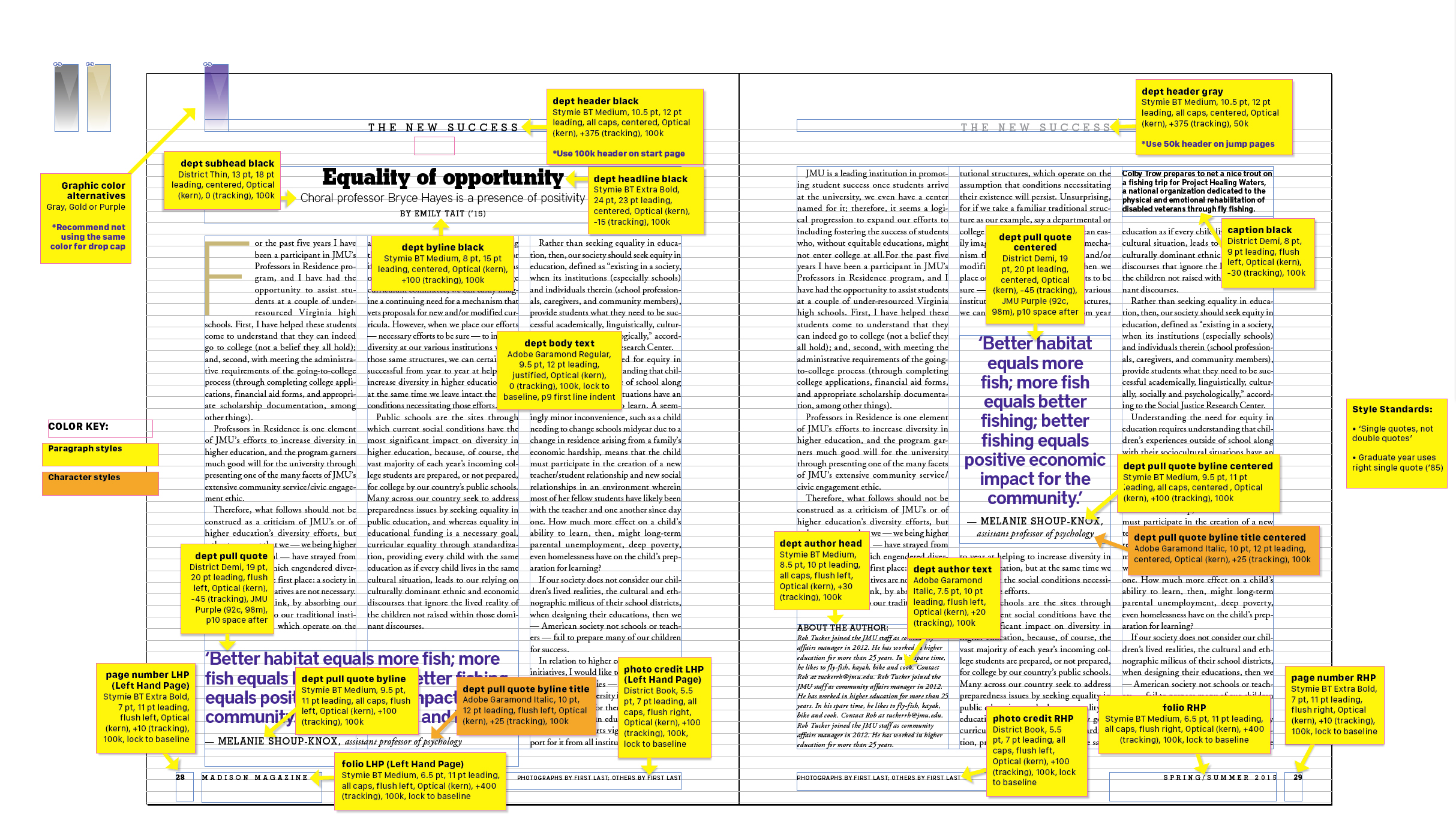
Madison magazine uses purple and gold to align with JMU's brand. Use of color guides the reader through each page by creating visual flow, hierarchy and emphasis.
- There are not specific “magazine only” colors. Colors are chosen to enhance the content. This can happen either by bringing out a secondary color as a highlight or even to subdue a dominant color by using a complementary choice.
- Many of the standard page elements of Madison are purple and gold. For example, small graphic devices (like the purple bookmark in the upper left corner of pages) signifies the start of something new.
- Pullquotes are often purple, or an accent color to attract attention but not visually overpower the rest of the page.
- Drop caps are another good place to add color that complements the text.
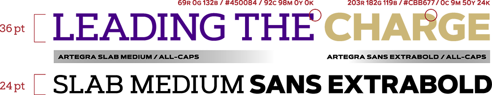
Brand typography
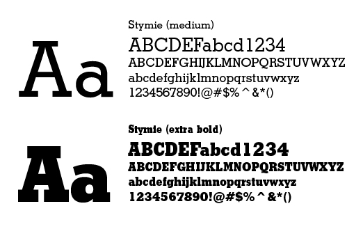
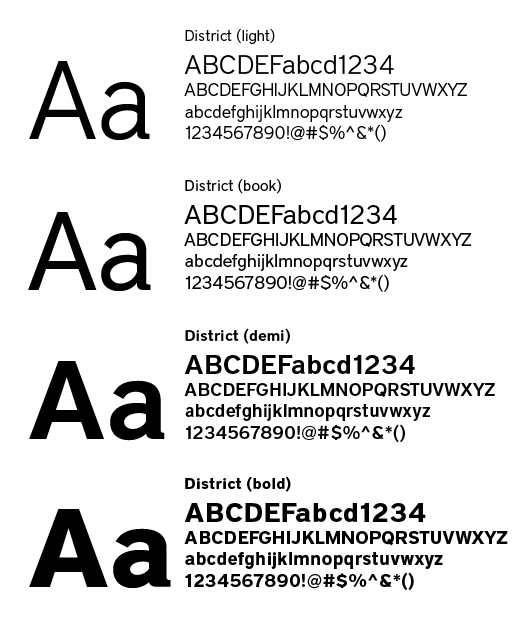
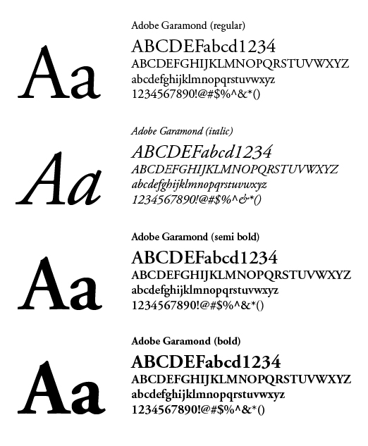
Madison brand typography includes preferred font families. The serif font Adobe Garamond is for body text and the sans serif font Adobe District is for headlines, sidebars and captions. The slab serif font Adobe Stymie is also appropriate as an alternate headline font, and Adobe Franklin Gothic may be used as accent font.
Stymie BT
Adobe District
Adobe Garamond
Typographic elements for print
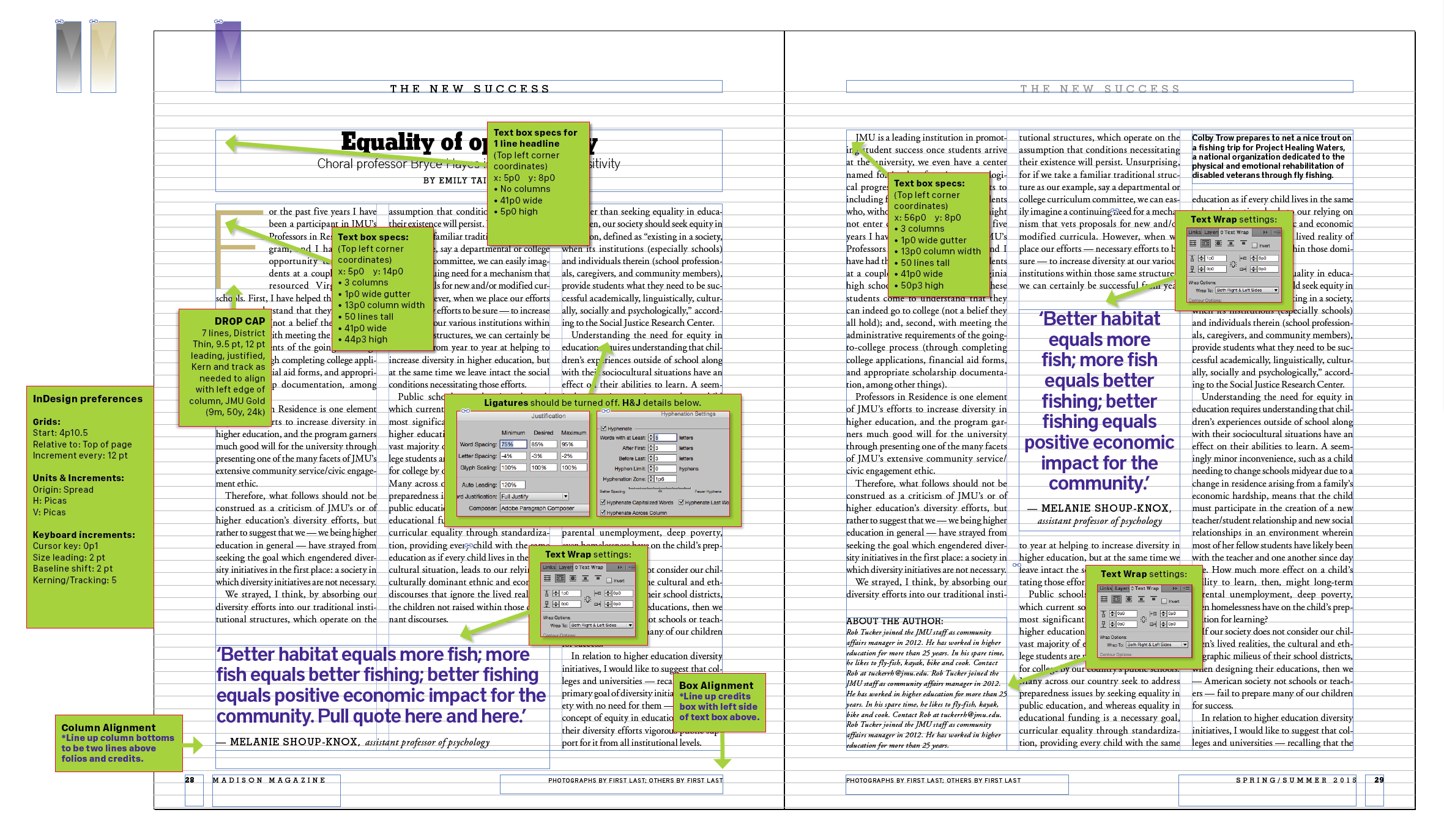
Brand typography has composition standards. Typefaces, font weights, point sizes and template grid shall be consistent throughout an article. Formatting headline and body text depends on the audience and message.
With formal typography, headlines may be centered and body text justified. With informal typography, headlines may be flush left and body text flush left/ragged right.
For formatting a headline, make sure it is adjacent to its body text and avoid all capital characters using a serif font in a long headline that has more than a few words on one line.
For formatting body text, the first paragraph is always flush left to the margin (no indent). For subsequent paragraphs, either indent the first line with no line space after the paragraph or make the first line flush left to the margin with a line space after the paragraph. Never combine both elements in an article.
Graphic heading style
This is a sample heading style for print that mimics the typography of the Being the Change mark. It can help to create our brand feel and be a subtle tie-in to the tagline. The “Doing the Thing” word pattern can be used, or the style can simply be applied to the heading of your choice.
Drop caps
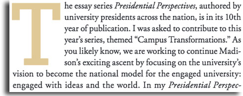
In editorial design, the drop cap signifies the first paragraph of a story. It either replaces the first letter of the paragraph with text running around it or the drop cap goes behind the opening lines of text. The drop cap character size should be a minimum of five lines deep and may extend well into the next paragraph. The font should either match the story font or contrast it. For example, a sans serif drop cap nicely contrasts serif text. Drop caps are often brand colors or may match a significant color from a photo or graphic within the story.
Bullets

Use distinctive dingbat graphics like squares or triangles in brand purple or gold colors. For bold graphics like squares, make the dingbat point size slightly smaller than the point size of the text. Avoid generic dot bullets associated with commonplace desktop publishing. Adobe ITC Zapf Dingbats is the preferred font.
Web urls

Display URLs at the end of a paragraph or the bottom of an ad. Set off using brand colors in a bold font, preferably sans serif, for quick recognition. When displaying websites that contain “www.” such as www. jmu.edu, delete the http:// from the beginning of the URL. Avoid breaking a URL to two lines. If this is necessary, make sure no hyphens are inserted and break the URL between whole words.
Magazine-specific typography
Paragraph and character styles can be found here.
InDesign settings for magazine design can be found here.
Effects
Drop shadows
Effects like drop shadows are typically used under layered images or graphic elements to differentiate and/or guide readers' focus.
Gradients
Gradients are used in department header typography to minimize visual conflicts and brand stories to be part of sections of info.
Hours of Operation:
Mon - Fri 8 a.m. - 5 p.m.