Guidelines
Images on the web should always
- be consistent with the University's brand standards for photography
- be high resolution—never blurry or pixelated
- make sense in the context of the page and the website
Office of Annual Giving photography:
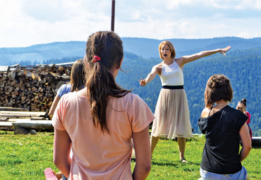
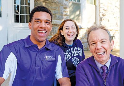
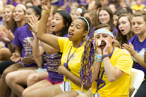
Photos should primarily consist of people either laughing and happy or engaged in doing something.
Extend Your Reach photos are taken with a purple filter over the flash which is located behind the subject and the tip of the finger is in focus while the rest of the picture is out of focus. The shot does not include the head.
NOTE: The Extend Your Reach photos that exist, already have the icons and the lens flare added in the photoshop file. To make new ones those layers must be added to the new files.
 |
 |
 |
Valley Scholars photography
Documentary and candid style

Women for Madison photography
JMU campus doors and bluestone background
 |
 |
Primary
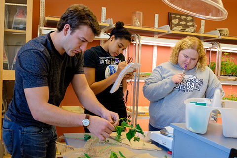
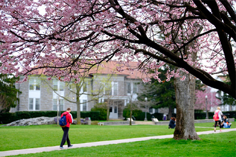
- Photojournalistic style, candid, realistic
- a mix of primarily students, faculty and campus shots
- avoid overly posed and staged
- ethnic diversity should be portrayed naturally whenever possible
- in general, images that feel like commercial stock photography should be avoided

Secondary
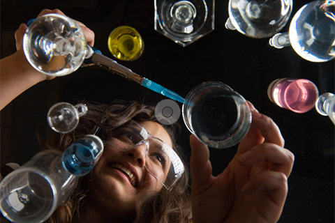
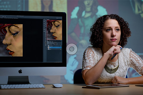
- Portraits of students and faculty used in telling their specific personal stories should be descriptive of what their interests and programs of study are.
- They should be artfully designed and tell a story.


Chapters & events
- Show groups of happy alums
- Show interaction, relationships, purple pride



In the most recent design update to Cascade sites, full-width Site Heading Images were introduced. These images are intended to be an evergreen identity for a website.
Site Heading Images should:
- Provide enough contrast for the Site Title to be clearly visible as it overlays the image
- Have a central focal point (horizontal and vertical cropping may occur at some resolutions)
- Not be too distracting from the page content (avoid faces in particular)
Site Heading Images must be approved and updated by digitalmarketing@jmu.edu.


