Jump to section
- Primary logo (block JMU with James Madison University)
- James Madison University logo without block JMU
- Block JMU logo
- • Primary logo color variations
- • Logo best practices
- • Institutional & Athletics logos
- James Madison University wordmark
- JMU secondary mark (department/office unit logos)
- James Madison University seal
- Being the Change wordmark (university theme)
- • Being the Change with JMU logo
- James Madison signature
Primary logo (block with James Madison University)
The combination of the one-color* block JMU and the updated logotype is the official James Madison University logo. In an effort to modernize the logotype, we have eliminated the font Trajan, utilizing, instead, Artegra Sans for “James Madison” and Artegra Slab for “University.”
This logo is the face of our identity. It unites us and connects the world to our brand.
*NOTE: The block JMU has several other color iterations earmarked exclusively for JMU Athletics. All institutional instances of the block JMU will utilize the one-color version as shown at right.
Black stacked
Purple stacked
White stacked
Black horizontal
Purple horizontal
White horizontal
Safe space
A mandatory “safe space” around the logo must be incorporated into any design using the logo. The safe space for both the stacked and horizontal logos is defined by the height of the letter J within the block JMU.
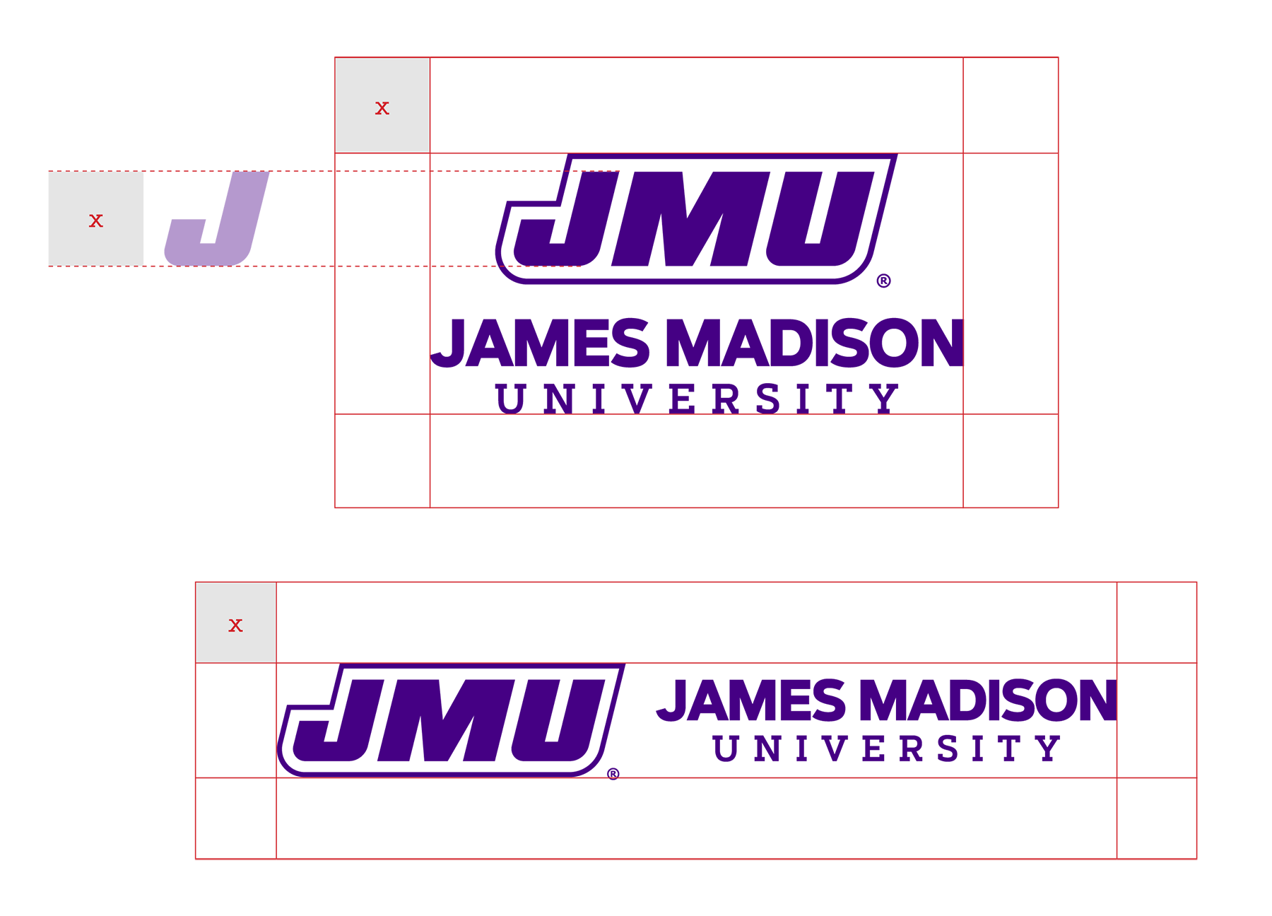
Minimum size
The logo may never be scaled so that the block JMU is smaller than .25” high. At this size the stacked logo is 1.0174” wide and the horizontal logo is 1.8568” wide.

James Madison University logo without block JMU
In some circumstances, the university logotype may be separated from the block JMU.
Block JMU logo
In some circumstances, the block JMU may be separated from the logotype. As is the case with the previous iteration of the logo, the safe space is defined by the height of the letter J.
NOTE: As it pertains to JMU Athletics, the block JMU has another set of comprehensive guidelines which can be accessed at: jmusports.com/sports/2020/7/2/jmu-logos-and-marks
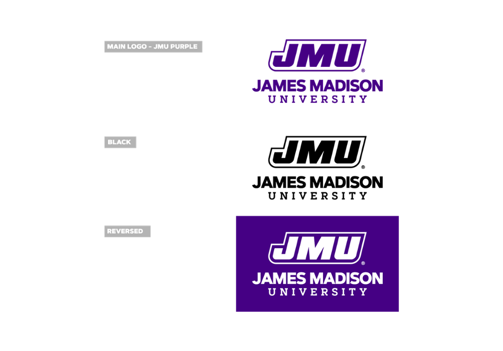
Primary logo color variations
The JMU logo may only appear in JMU Purple, black, or white (reversed) as shown.
Safe space and min width
When the logotype is used without the block JMU, the safe space is defined by the overall height of the logotype.

The logotype may not be scaled below 1” wide.

JMU purple
Logo best practices
The examples at right show some best practices for our new institutional family of logos. Some basic guidelines are outlined below:
- The James Madison logo shall be legible.
- The logo is federally registered and must be displayed with the standard registration mark “®.”
- The logo shall not be used as a background image or watermark.
- The logo shall appear proportionately and in its entirety. No part of the logo may be altered, skewed or stretched.
- When the logo appears on a solid dark background, the white logo version must be used.

Incorrect logo usage
- Do not tilt, skew or scale the mark disproportionately.
- Do not change the colors of the mark.
- Do not scale the mark below the allowed width.
- Do not remove or rearrange the elements of the mark.
- Do not crop or alter the mark.
- Do not add graphic elements to the mark.
- Do not compromise legibility of the mark.
- Do not outline the mark.

Institutional & Athletics logos
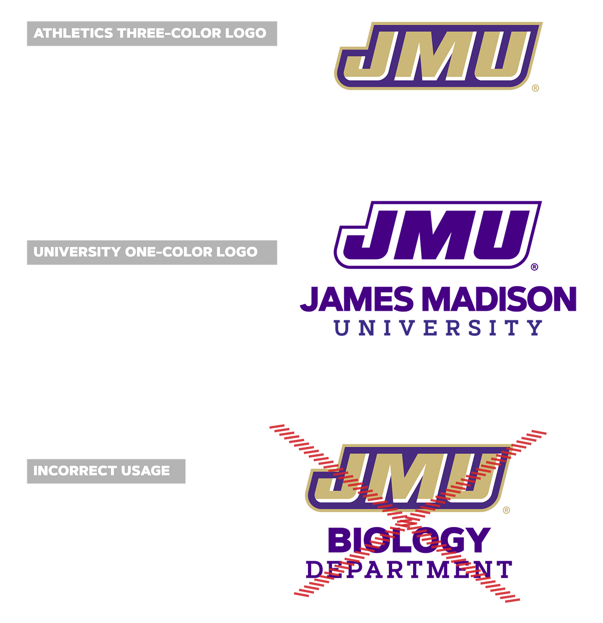
A component of the new university logo is actually not new. The block “JMU” was the institution’s primary mark throughout the 1980s and ‘90s, and has since been used by JMU Athletics in various forms.
Now that the institution has revived the JMU block as part of its primary logo, it’s important that all campus partners understand the distinction between university marks and athletics marks: the university block JMU is one-color and the athletics mark is two-color. They are not interchangeable.
James Madison University wordmark
The James Madison University wordmark is a one-line typographic treatment derived from the James Madison logo. The wordmark is a vector graphic created from the logo font with specific ligatures and letter kerning that may not be reproduced using a font. Always use university brand colors or black and white for the wordmark.
JMU Purple
Safe space
The safe space is defined by the height of the wordmark multiplied by 1.75.
The wordmark may not be scaled smaller than 1.75” wide.


JMU secondary mark (department/office unit logos)
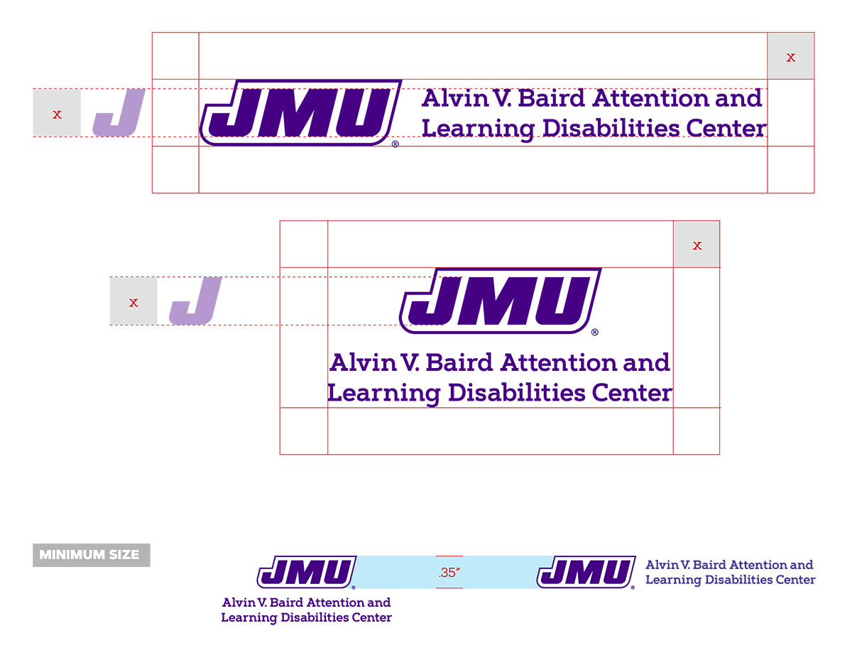
The James Madison logo secondary marks are used to display a JMU office or department name with the block JMU. If your office or department needs a James Madison logo secondary mark, please fill out this form.

A mandatory safe space around the logo must be incorporated into any design using the logo. The safe space for both the stacked and horizontal logos is defined by the height of the letter J within the block JMU.
The system logos may never be scaled so that the block JMU is smaller than .35” high.
James Madison University seal
Reserved mostly for formal events, the James Madison University seal may appear in JMU Purple or black. The JMU seal must be displayed according to these standards.
- The James Madison University seal shall be legible.
- The James Madison University seal is not a logo and shall not be used as such.
- The James Madison University seal shall not be used for prospective student materials. The primary logo should be used for prospective students.
- The James Madison University seal is a registered trademark and always shall be accompanied by “TM.”
- The James Madison University seal is surrounded by a “clear area.” No words or graphic elements shall ever overprint, touch or appear behind it.
- The James Madison University seal shall be used in its entirety. No part of the seal shall be used separately.
- The James Madison University seal shall not be used as a background image.
- The James Madison University seal typeface, proportions and placement of elements shall not be altered.
The JMU seal represents the original coat of arms of President James Madison’s family.
“James Madison University” encircles the top of the seal and the founding date of “1908” is at the bottom. The center of the seal has a coat of arms with ornate mantling and a closed knight’s helmet that’s crested by a torch. Below it is a shield containing axes and starred chevrons. The inscription Knowledge Is Liberty, an expression that represents the sentiment of many of James Madison’s writings, completes the coat of arms.
The university theme, Being the Change®, embodies this concept: Madison professors, students, alumni and donors have been changing the world since the university’s founding in 1908. Through the years, in so many ways, on and off campus, Madison’s people have embraced the idea of change—finding their own ways to make a difference in the world.
Horizontal
Safe space
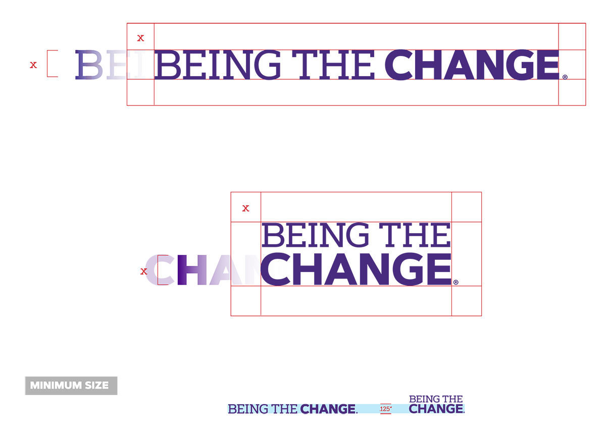
The safe space for the horizontal Being the Change wordmark is defined by the height of the letterforms.
The safe space for the stacked Being the Change wordmark is defined by the height of the word “change.”
The minimum size of the horizontal wordmark may not be scaled below .125” high. The stacked wordmark, when scaled proportionately, may not be scaled below .2678” high, a dimension that is defined by the height of the word “change,” which may not scale below .125” high.
When the JMU logo appears with the Being the Change wordmark, it should be accompanied by a dividing rule. The dividing rule may be JMU Purple, JMU Gold or white when utilizing the reversed versions of the logos.

The Being the Change wordmark and dividing rule should never appear closer to the JMU logo than the height of the letter J within the block JMU.
The width of the Being the Change wordmark when paired with the stacked version of the JMU logo is defined by the overall width of the stacked JMU logo.
The height of the Being the Change wordmark when paired with the horizontal JMU logo is defined by the overall height of the James Madison University logotype.

James Madison signature
Reserved mostly for formal events, the James Madison Signature may appear in JMU Purple, black or white (reversed).
The James Madison signature must be displayed according to these standards.
- The James Madison signature shall be legible.
- The signature should be surrounded by a “clear area” defined by the height of the “M” in Madison. No words or graphic elements should ever overlap, touch or appear behind it.
- The signature shall be used in its entirety. No part of the signature shall be used separately.
- No part of the signature may be altered, skewed or stretched.
- When the signature appears on a solid dark background, the white signature must be used.

