Typography for print
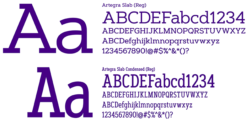
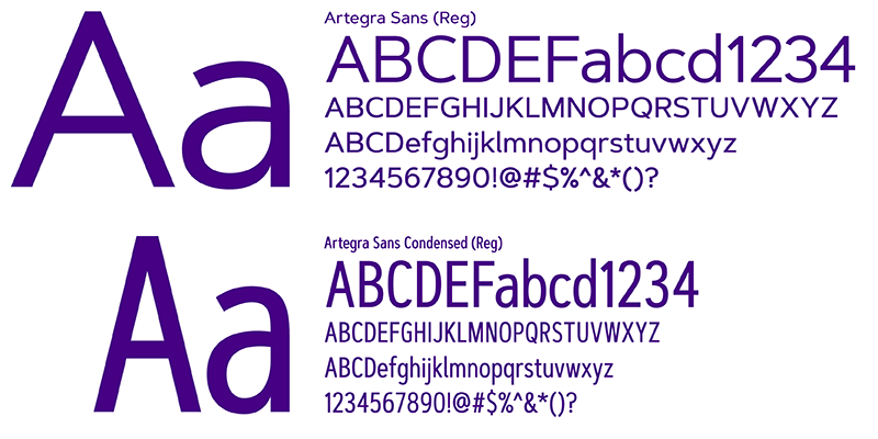
James Madison University’s primary type family is Artegra (sans and slab), both are contemporary and comprehensive typefaces consisting of over 200 total fonts. This versatile family has multiple weights and supports upwards of 100 languages. Both elegant and easy to read, Artegra is suited for display and text purposes and is a cornerstone of the JMU brand.
Because of a limited number of licenses, fonts are only available for JMU Faculty and Staff: Please email visualbrand@jmu.edu for access to download the Artegra fonts
Artegra Slab contains 54 fonts with over 1000 glyphs per font in condensed, normal and extended widths. With Cyrillic and Greek sets it supports more than a hundred languages. It’s based on the perfectionist geometric shapes of Artegra Sans, which makes it beautiful to look at and easy to read.

Artegra Sans contains 160 styles and offers 9 weights with true italics in normal, condensed, and extended widths. Each font contains over 1500 glyphs and supports multilingual including Latin and Cyrillic. It includes various Opentype features like small caps, alternates, and more.

Typographic elements for print
Brand typography has composition standards. Typefaces, font weights, point sizes and template grid shall be consistent throughout an article. Formatting headline and body text depends on the audience and message.
With formal typography, headlines may be centered and body text justified. With informal typography, headlines may be flush left and body text flush left/ragged right.
For formatting a headline, make sure it is adjacent to its body text and avoid all capital characters using a serif font in a long headline that has more than a few words on one line.
For formatting body text, the first paragraph is always flush left to the margin (no indent). For subsequent paragraphs, either indent the first line with no line space after the paragraph or make the first line flush left to the margin with a line space after the paragraph. Never combine both elements in an article.
Graphic heading style
This is a sample heading style for print that mimics the typography of the Being the Change mark. It can help to create our brand feel and be a subtle tie-in to the tagline. The “Doing the Thing” word pattern can be used, or the style can simply be applied to the heading of your choice.

Drop caps

In editorial design, the drop cap signifies the first paragraph of a story. It either replaces the first letter of the paragraph with text running around it or the drop cap goes behind the opening lines of text. The drop cap character size should be a minimum of five lines deep and may extend well into the next paragraph. The font should either match the story font or contrast it. For example, a sans serif drop cap nicely contrasts serif text. Drop caps are often brand colors or may match a significant color from a photo or graphic within the story.
Bullets

Use distinctive dingbat graphics like squares or triangles in brand purple or gold colors. For bold graphics like squares, make the dingbat point size slightly smaller than the point size of the text. Avoid generic dot bullets associated with commonplace desktop publishing. Adobe ITC Zapf Dingbats is the preferred font.
Web urls

Display URLs at the end of a paragraph or the bottom of an ad. Set off using brand colors in a bold font, preferably sans serif, for quick recognition. When displaying websites that contain “www.” such as www. jmu.edu, delete the http:// from the beginning of the URL. Avoid breaking a URL to two lines. If this is necessary, make sure no hyphens are inserted and break the URL between whole words.
Sans-serif: Arial, Helvetica, sans-serif

Serif: Arvo, Georgia, serif

Type sizes for web
The quick brown fox jumps over the lazy dog The quick brown fox jumps over the lazy dog The quick brown fox jumps over the lazy dog The quick brown fox jumps over the lazy dog The quick brown fox jumps over the lazy dog The quick brown fox jumps over the lazy dog
Arial 16px, line-height: 24px default paragraph typography
The quick brown fox jumps over the lazy dog
H1: Arvo 32px used in page title
The quick brown fox jumps over the lazy dog
H2: Arvo 28px used in content headings*
The quick brown fox jumps over the lazy dog
H3 Arial 26px used for content heading*
The quick brown fox jumps over the lazy dog H4 Arial 22px
H4 Arial 22px used in action link
The quick brown fox jumps over the lazy dog H5 Arvo 18px
H5 Arvo 18px used in link list
The quick brown fox jumps over the lazy dog
H6 Arial 12px, all caps, letter-spacing: .75px
*Use H3 when the content heading is directly below the page title (in the gold below navigation); H2 can be used below an image banner or when there is content separating the H2 from the page title.

Text styles for web
|
In line links: |
In line link example: |
|
Basic list: |
|
|
"read more" link: |
Read more example: |
|
Pullquote: Pullquote-attribution: |
Pullquote example: "This is something cool that was said at some point in time" —by Mr. So and so |
Text formats for web
|
Phone numbers: |
(XXX) XXX-XXXX |
|
Web urls: |
x https://www.jmu.edu/admissions/visit/index.shtml |
|
Headlines: |
x Research Opens Doors For Freshman |
To build emails with approved typography, please use iModules templates and complex items.


