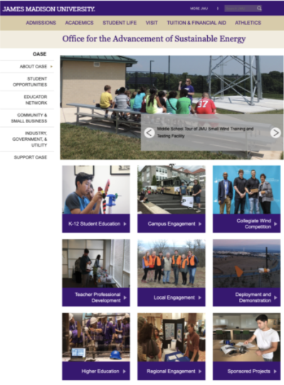
The second type of multi-block content you can specify for a grid cell is an Action Link. In this page's tutorial, we will review what Action Links are and how to create them.
An Action Link is simply some text with a triangle next to it, with a colored background, and an optional image on the top. It’s a more noticeable way to link to something, especially when an image is added to the Action Link. Action Links should be used when you want links to stand out.
With images:

Without images:

Within a multi-block:
- Start with a new grid cell; if needed, add a new grid cell
- Set the grid cell width to 1/4, 1/3, or 1/2, depending on the layout of the page, and the length of the text in the link. We do not recommend full-width action links.
- Select the "Yes" button under "Action Link?" to reveal Action Link options
- Note: If you select "Yes" to more than one type in a single grid cell, see Troubleshooting: Cascade Errors.
- Type the text you want to display on the Action Link in the Action Link Text field
- Select a background color
- (Optional): Add an image
- Add an internal/external link
Action Link images should be 1/3, 1/4, or 1/2 width. Find ready-to-use images here_images/_action-links
Follow these dimensions for using other images:
- Resolution must be 72dpi
- Recommended file format is .jpg with quality of 8
| ACTION LINK | width | height |
|---|---|---|
| quarter | 360 | 376 |
| third | 480 | 346 |
| half | 488 | 236 |
Too many Action Links
Action Links were originally designed to be a “CTA”, not a way to display many links on a page.
If you are displaying more than one Action Link on a page, it can get distracting for the user, especially if each Action Link contains an image.
In this example, the use of several action links with images is not very useful. The user with either ignore the images altogether, or to work harder to find the connection between the image and the text below.
Action links should be used sparingly, not in a “wall” as shown here.
Try not to have more than 3 action links in a single row on a page.

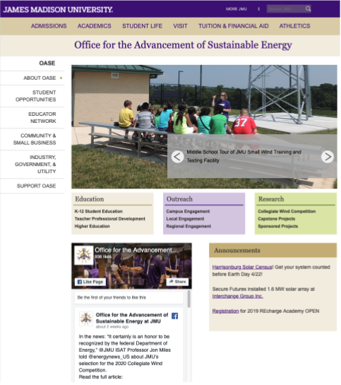
Solution: Consider using a single button along with an Action Link if you have two CTAs, and position them hierarchically according to your goals. If you have a need for more than two CTAs, it becomes more complicated and distracting for the user, and a meeting with Digital Marketing may be helpful. Sometimes clickable items are not CTAs, but merely links to other locations. In that case, Link Lists are the most effective way to present those links.
In this example, we have converted the "wall" of action links to categorized link lists, making this information more useful.

Before:

After:


