The following tutorial contains general instructions for how to insert and edit different types of images to any type of Cascade document. If you want to add a specific type of image for a particular Cascade Document, find instructions and sizing requirements in the following locations:
There are two ways to upload an image in the Cascade system:
- WYSIWYG Upload method
- "Add Content" method
While both methods allow you to quickly upload an image, the WYSIWYG Upload method saves you time in the future because you are uploading the image directly to where you want it to be, whereas with the "Add Content" method, you will add an extra step by navigating to the WYSIWYG content field and browsing for your uploaded image within your _images folder.
Method 1: Upload an image via a WYSIWYG content field
- In any WYSIWYG content field, click the "Insert/edit image" button in the toolbar
- In the pop-up, select "Internal" and click "Choose File"
- In the right-hand pane, choose "Upload"
- Drag and drop your image into the designated box or click "choose" to browse your computer for your image
- Note: Make sure you rename your image file according to Cascade image naming guidelines
- Place the image into your appropriate _images folder.
- Click "Choose" in the top-right corner of the pane, and then click "Ok"
- In the vertical ellipsis, select "Check Content and Submit"

Method 2: Upload an image via the "Add Content" menu
- Select: Add Content > _ALL > Images > Custom
- Upload your image and save it in your appropriate _images folder
To add images to a Cascade Document, you can either select an existing image within an _images folder or from the internet.
Note: Adding images to an "EZ" page content area and adding images to multi-blocks require different steps, which are both explained below.
Inserting images to the "EZ" page content area
To add an image to an "EZ" page content area from an _images folder, follow these steps:
- On the "EZ" page, select "Edit" in the top toolbar
- In the WYSIWYG content area, click the "Insert/edit image" button in the toolbar
- In the pop-up, select "Internal" or "External" for image source. "Internal" images are images that exist in the Cascade system.
- For internal image sources:
- If the image is not already in the Cascade system, see the directions above for uploading an image.
- If the image already exists in the Cascade system, use the "Choose File" button and select "Browse" to search for the image in your "_images" folder or select "Upload" to upload an image from your computer.
- For external image sources:
- Copy the link of the image you want to insert, and paste it into the "Image" field
- WARNING: If you use an "External" image, which exists on some other webserver out on the internet, the image could be deleted at any time, which could result in a broken image on your website.
- For internal image sources:
- Do not check the Decorative image box; instead, add an image description
Note: Remember, images added in the "EZ" page content area will not be responsive; therefore, images wider than 800px will stay the same size and won't shrink down for mobile devices. If you want the image to expand and shrink automatically so it looks good on both desktop and mobile, you will want to make it "responsive."
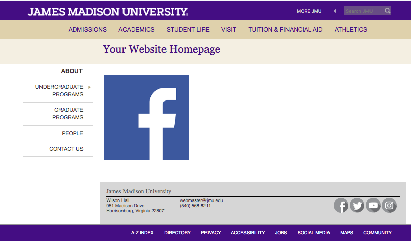
The first example is a screenshot of an EZ page with an image without "full-width-image" class; without the class, it cuts off part of the image because it is greater than 800px.

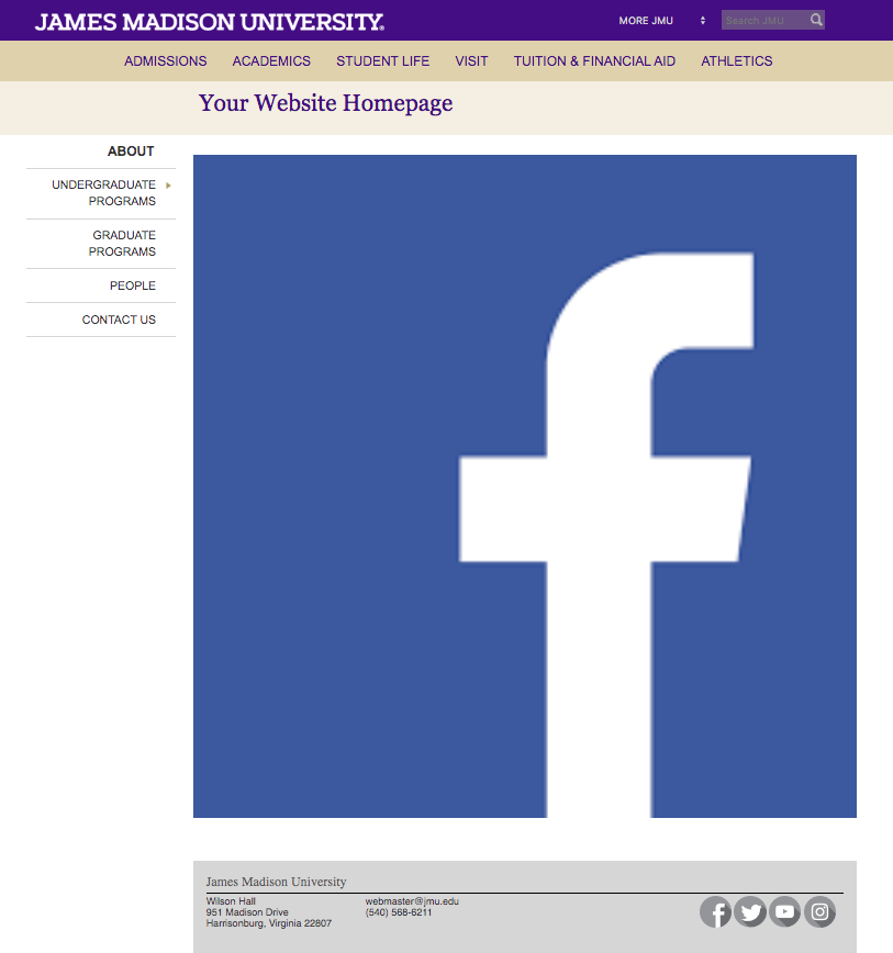
The second example is a screenshot of an EZ page with an image with "full-width-image" class; the class allows you to see the full image.

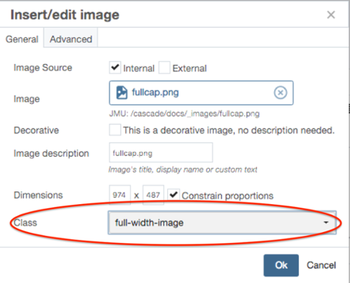
To make the image responsive, click the "Class" dropdown and select "full-width-image" (make sure the width of the image is at least 800px, or else, it will look pixelated).
Inserting images into "multi-blocks"
By default, images that appear in multi-blocks are automatically "responsive," which means they will expand or contract to the exact width of their grid cell. For example, if an image is placed in a ⅓ wide grid cell, the image will appear as ⅓ width on desktop browsers, and will automatically expand to full width when on mobile browsers.
If you want the image to be non-responsive (meaning the image will appear as its "literal" width and will not automatically fit itself to the full width of its grid cell) the image needs to be small (but not too small) so they fit on most mobile screens. We recommend non-responsive images to be 310px wide.
The first example is a screenshot of a page with an image (within a multi-block) without literal-width-image class:
The second example is a screenshot of a page with an image (within a multi-block) with literal-width-image class:
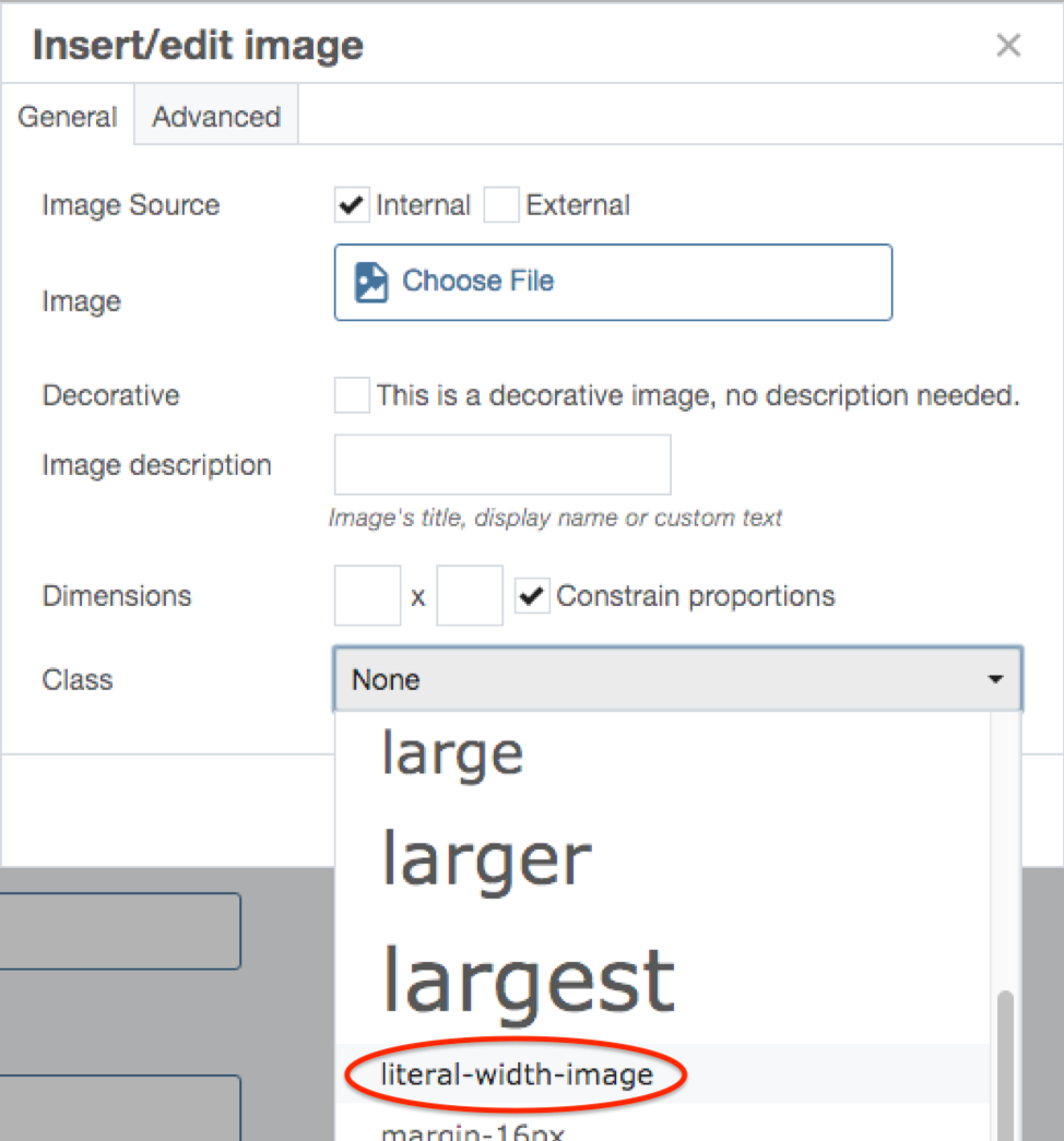
To make your image stay the same size no matter what the screen size is, choose the "literal-width-image" class (example below).
- In a multi-blocks's WYSIWYG content field, click the "Insert/edit image" button in the toolbar
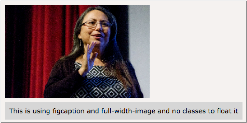
- Click the “Advanced” tab and check “Use figure and figcaption for this image”

- Then back on the General tab, in the Styling selection menu, add the full-width-image class.

- Click "Ok" and return to the WYSIWYG content field
- Click the area below the image to type a caption
Images can be aligned left or right to allow text to wrap around it. You can only wrap text around images that are 310px wide; if the image is any larger, it won’t respond properly on all devices. To wrap text around an image, follow these steps:
- Either in an "EZ page content area or a multi-block's WYSIWYG content field, add an image of the correct size (if you do not know how to resize your image, see resizing images for instructions)
- Click on the image in the content field, and then in the content field's toolbar, select the Formats dropdown menu, and within the Customs tab, apply either float-left-image or float-right-image class
- Note: If the image is in a multi-block's WYSIWYG field, you must also apply the literal-width-image class from the Formats > Custom dropdown menu. If you do not do this, the image will expand to the full width of its grid cell, and it would be impossible for text to wrap around it.
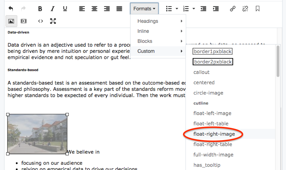
- Note: If the image is in a multi-block's WYSIWYG field, you must also apply the literal-width-image class from the Formats > Custom dropdown menu. If you do not do this, the image will expand to the full width of its grid cell, and it would be impossible for text to wrap around it.
- Select "Submit" in the vertical ellipsis and return to the page to view text wrapping (you will not be able to see the changes in the WYSIWYG editor until you submit)

Wrapping text around captioned images
Captions with text wrapping can only be applied to images that are 310px wide; if the image has the incorrect width dimension, this will not work. If you do not know how to resize your image, see resizing images for instructions.
- Either in an "EZ" page content area or a multi-block's WYSIWYG content field, click the "Insert/edit image" button in the toolbar to add an image of the correct size
- In the pop-up window, Click the "Class" dropdown and apply either image-caption-310-left or image-caption-310-right class
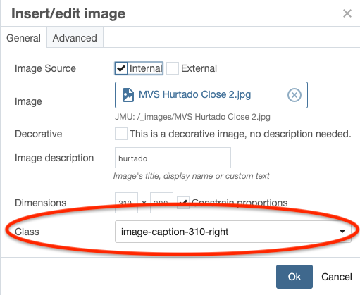
- Click the "Advanced" tab and check "Use figure and figcaption for this image"

- Click "Ok" and return to the "EZ" page content area or multi-block's WYSIWYG content field
- Click the area below the image to add a caption
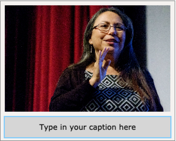
- Select "Submit" in the vertical ellipsis and return to the page to view text wrapping (you will not be able to see the changes in the WYSIWYG editor until you submit)
On the JMU homepage, there are three buttons that use the hover image feature to display different images when they are hovered over.

If you want an image to change when hovered over, follow these steps:
- On your computer, duplicate the image you want to add the hover image feature to, but change the background color of one of them.
- Rename both images with the same name, except for one of the images, add "-hover"
- For example, if the name of your images are "button", you would name one image "button.png" and the other image "button-hover.png"
- In the top-left corner of Cascade, select: Add Content > _ALL > Images > Custom
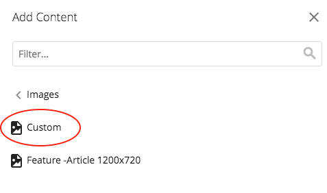
- Upload the hover version of the image

- For the display name, replace "user.jpg" with the hover image's name
- Place the image in your website's "_images" folder
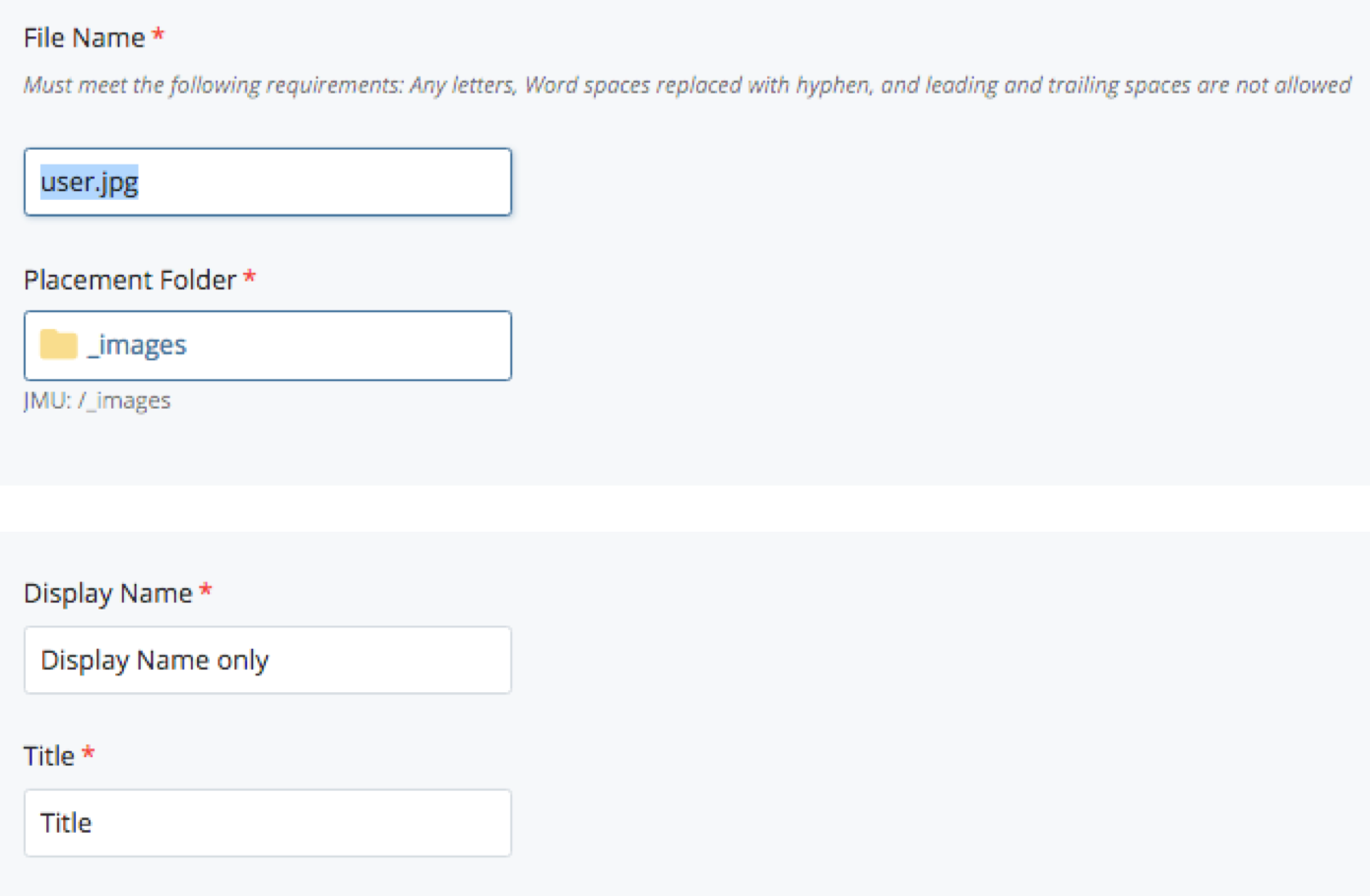
- Select "Submit" in the vertical ellipsis and publish the image
- In the "EZ" page content area or the multi-block's WYSIWYG content field where you want to display the hover image, click the "Insert/edit image" in the toolbar
- Upload the original image, and in the Class dropdown, select hover-image
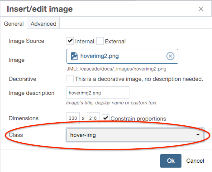
Note: You will not see the hover image feature until the page is published.

Spot images are images with links that are designed to draw attention, much like advertisements. This means they should be used sparingly; if a page is filled with spot images, viewers will not know which spot image to pay attention to or which is most important. Mix up Spots with Action Links and Link Lists and other content so that people notice the Spots more.
To use a Spot image on a page, you will either have to select from an existing Spot or have a custom spot made for you.
- To use an existing Spot, locate the _spots folder in the Site Content panel (JMU > _images > _spots) or click _images/_spots.
- If you need a custom Spot, please contact marketingemail@jmu.edu.
Once you have either an existing Spot or custom Spot, follow these instructions to upload it on to your page:
- Either in an "EZ" page content area or a multi-block's WYSIWYG content field, select the "Insert/edit image" button in the toolbar
- In the Insert/edit window, click "Choose File" and either navigate to an existing Spot or your custom Spot
- Click "Ok" and return to the "EZ" page content area or the multi-block's content field
- Select the Spot image in the "EZ" page content area or the multi-block's content field and add a link to where you want the image to redirect your user
| SPOT | width | height |
|---|---|---|
| quarter (1/4) | 360 | 493 |
| third (1/3) | 480 | 480 |
| half (1/2) | 488 | 312 |
| two thirds (2/3) | 658 | 316 |
| full-width | 820 | 273 |


