The first option of content you can choose within a multi-block's grid cell is WYSIWYG (What You See Is What You Get). This option is called WYSIWYG because the content that you can add looks very similar in the editing interface to how it will look on the published page.
Before learning step-by-step instructions on how to create a WYSIWYG multi-block, familiarize yourself with the multi-block's layout and the sections with which you will be working when creating your multi-block.
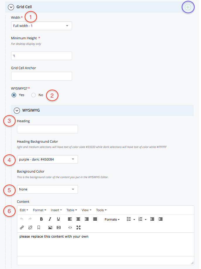
- Width. In the width dropdown menu, you can select what width you want a grid cell to be. Adjusting the width of grid cells allows you to arrange them in a particular way on your page. For example, if grid cell 1 and grid cell 2 are both 1/2-width, then they will appear side-by-side on your page.
- Note: Notice the green plus sign cirlced in blue on the righthand side of the grid cell section. Click this icon to add additional grid cells to your page if needed.
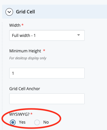
- Grid cell's content type. These Yes/No options allow you to assign one of the four content types (WYSIWYG, Action Link, Link List, and Video) to a particular grid cell. In this example, we are exploring the WYSIWYG option.
- Heading (optional). The heading is the title you can ascribe to a grid cell. On this page, "Step 1: add and adjust grid cell width" below is what a grid cell heading looks like.
- Heading background color (optional). You have 13 color options you can assign to the background of the heading. In "Step 1: add and adjust grid cell width" below, the background color is light gold.
- Background color (optional). The background color refers to the content field's background color, from which you have 5 color options to choose from.
- Content. The content field is where you can add text and links and insert images and videos.

Here is an example of a WYSIWYG grid cell with a dark purple heading, and a light purple background, with a simple bullet list, bolded text, and a link:

Step 1: Add and adjust grid cell width
Within a multi-block:
- Start with a new grid cell; if needed, add a new grid cell
- Set the grid cell width to your preferred width
Step 2: Choose WYSIWYG for the grid cell
Before creating and customizing your multi-block, you will need to specify what type of content you want to display in a grid cell. Select "Yes" to create a WYSIWYG grid cell within the multi-block.
Note: If you select "Yes" to more than one type in a single grid cell, an error will occur on the page. To fix the error, simply deselect the additional type(s) of content so that only WYSIWYG is selected. See Troubleshooting: Cascade Errors for more details.

Step 3: Custom design the WYSIWYG
- (Optional): Specify a heading and add a heading background color
- Add content in the content box, including images, spot images, text with heading styles, and links
- Note: Images in multi-block WYSIWYG grid cells are always responsive, so if you want an image to not expand to the width of its grid cell (for example, if you want the image to be wrapped by text (right-/left-aligned)), it will need to be 310 px or less and have "literal-width-image" class applied. See NOTE: Images in Multi-Blocks
- Warning: text that is copied from sources like Microsoft Word can have extra formatting that can cause problems in Cascade. Here are two ways that you can avoid this:
- In the WYSIWYG editor you can select "Edit > Paste as text" to paste in the text. This will remove all formatting.
- If your content has HTML markup in it, use textfixer.com to format the copied text into HTML before pasting it into the content field. Once you have formated the text in Text Fixer, copy and paste the text into the source code area, which looks like "<>" in the content field's toolbar. If you are not copying and pasting text, simply type directly in the content field
- (Optional): Add a WYSIWYG text field background color
Too many buttons on a page
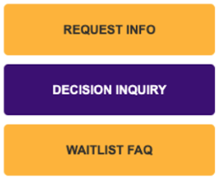
Ideally there should only be one button on each page, or else it becomes confusing for the user to know which button they need to click.
In the example to the right, there should either be one button (the most important one, probably “Request Info”) and the others could be converted to links in the page, or put in a link list.


