What are email templates?
Email templates allow users to quickly communicate answers to common questions. If a user is frequently needing to respond to similar emails a template may be beneficial. Email templates can be shared across multiple users. When you save a template to your departmental folder in the CRM other users in your department can use the template as well.
Where to Create Email Templates
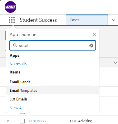
Click the 9-dot/waffle menu in the upper left and search for Email Templates and select Email Templates.
If your department does not currently have a folder for your email templates, click New Folder in the top right.
Select a name for your departmental folder and click Save.
Share Your Folder
To share your folder with colleagues so that they can use your templates as well, locate the folder you want to share under Created by Me, click the drop-down arrow to the right of the folder and select Share.
Type in the name(s) of the users/groups you’d like to share this folder with and choose the appropriate access level (view, edit, manage), click Share.
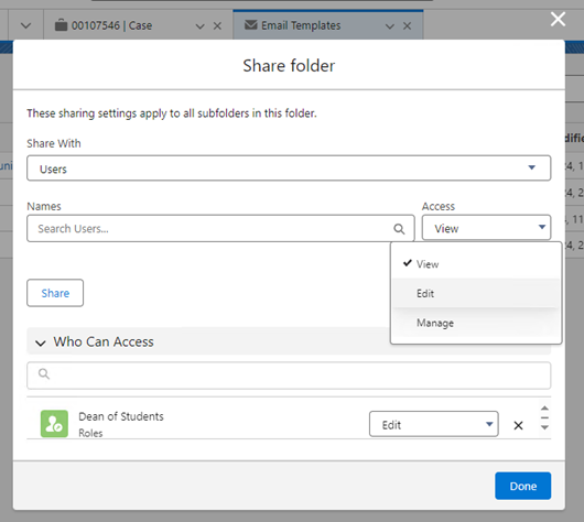
When you are finished sharing click Done.
How to Create a New Email Template
To create a new email template, click New Email Template.

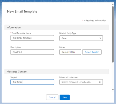
Enter a name for the template in the Email Template Name field. Select Case under the Related Entity Type.
Optionally, add a description for the template in the Description field to assist others with knowing what the template is for in the future.
Click Select Folder and choose the folder you want to save your templates in and click Select Folder.
In the Subject field, type in the subject to appear for the email and click Save.
Email Template Builder
After your template has been created, you can add your content using the Template Builder.
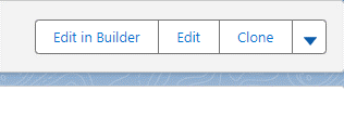
Click Edit in Builder in the top right.
There are three main areas in the Email Template Builder:
- Components Panel: content on the left-hand side of the screen that can be added to the template.
- Canvas: the center of the screen that shows the email template.
- Property Panel: right-hand side of the screen, this area allows you to customize components of the template.
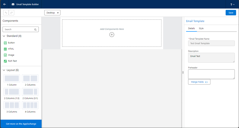
Components Panel
The left side menu contains a Components section and a Layout section.
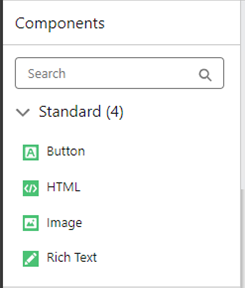
- Button: used to create a button in the email body that can be styled how you wish and hyperlinked. Examples: "survey", "learn more", "apply today"
- HTML: for advanced users with knowledge of HTML coding to insert additional styling or elements.
- Image: allows images to be inserted into the email template and is most useful for creating custom email header and footer images.
- Rich Text: where the main body of text will be entered. *Note: Each Rich Text component only allows for 10k characters to be used. If your text is longer than 10k characters, you will receive an error message. If you need more than 10k characters, add another Rich Text component beneath the first. You may need several Rich Text components depending on the length of your email.
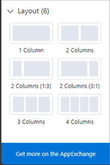
Layout section
This allows you to choose from various column layout options. Most templates will only use the one column option. To add a multi-column section drag and drop it to the canvas.
Canvas
This area is used to view and add components, either by dragging and dropping components from the Left Side Menu or by clicking the + icon and clicking the component you want to add.
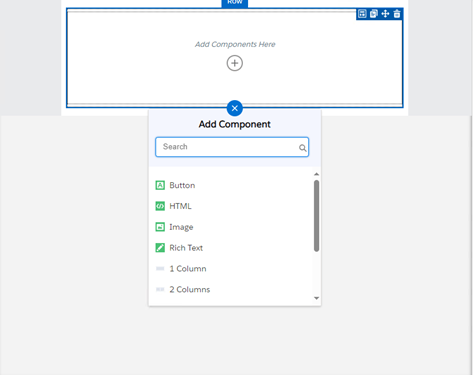
Once a component has been added to the canvas the component properties tools will appear. Each component has a few tools for ease of use in the top right when selected:

- Furthest left, this icon just sets the focus on the Property Panel.
- The second icon copies this component and adds it below.
- The third icon allows you to move the component within the template
- The trash icon can on the far right removes any content that was previously added to the component.
Property Panel (Customize components of email template)
This area is used to customize every component added to your email template. The properties that can be customized are dependent upon the component
Email Template
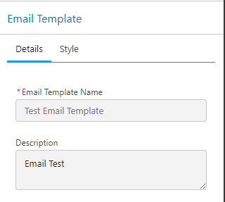
If you click outside of any component, the Email Template properties will appear in the Property Panel and can be customized.

The Details tab shows you the name and description of your email template. These cannot be edited from this view.
The Style tab has two customization areas:
- Background: allows you to change the background color and/or add a background image. *Note: The official JMU purple hex value is #450084. Please reference the JMU Style Guide for more information.
- Body: allows you to change the body color and padding margins. Most email templates will not require customizations here.
Button
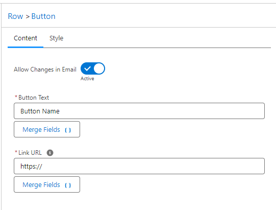
The Button component has two customization areas: Content and Style.
Content Tab
- Allow Changes in Email: This allows template users to modify the button when composing. It is recommended to make this Inactive.
- Button Text: the text displayed on the button.
- Link URL: the hyperlink that the button will point to when a recipient clicks on it.
Style Tab
- Button Text: options for styling the text of the button.
- Button Color: options for styling the color of the button.
- Button Size: options for adjusting the size of the button.
- Button Position: options for adjusting the alignment of the button and adjusting margins if needed.
HTML
This component is for advanced users with knowledge of HTML coding to insert additional styling or elements.
*Note: One common use for this is to insert dividing bars to separate the header and footer images from the email body text. For example, to do this with the official JMU Purple, you would enter the following:
<div style="background-color:#450084; bEditID:r2st1; bLabel:accent1; height:5px;"> </div>
Image
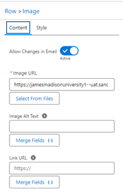
The Image component has two customization areas: Content and Style.
Content Tab
- Allow Changes in Email: If this is selected as Active, this will allow any user of this template to be able to remove or alter the image when composing an email.
- Image URL: Click Select From Files and upload your image. This field will then display the link from CRM where the image is located
- Image Alt Text: Enter the Alt Text to be displayed. Alt text is required for all images. For more guidance on writing good alt-text review the ODS alt-text guide.
- Link URL: You can hyperlink the image so that when a recipient clicks the image, it opens the link.
Style Tab
- Size: You can resize the image if necessary (typically, changing the image width from 100% to 50% is a good starting point if the image appears too large), once the image is a size you want select Enter.
- Position: This gives you various options for positioning your image. Choosing Center alignment is typical.
Rich Text
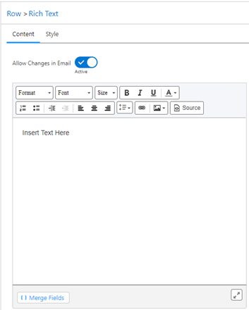
The Rich Text component has two customization areas: Content and Style.
Content Tab
- Allow Changes in Email: It is recommended to keep this setting Active so that users can modify the text of the email when needed.
- Editor: This is a WYSIWYG editor where you can type your template or copy/paste it from somewhere else.
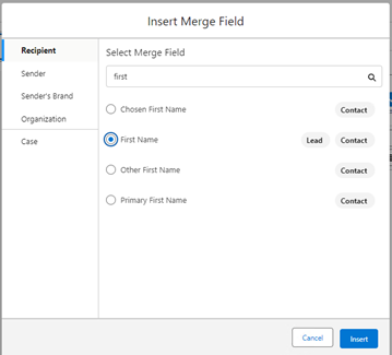
- Merge Fields: This is where you can access various fields of stored information on the recipient, the sender, or the department to save time when composing an email. For example, you can add the recipient name, address, student ID, etc. You can also include information about the sender the case, or department such as the department name, contact info, email signature, case number, etc. These fields are all searchable. It is recomended you preview the email before sending to ensure the merged fields show up as desired.
Style Tab
- Adjust margin padding
Changing device view
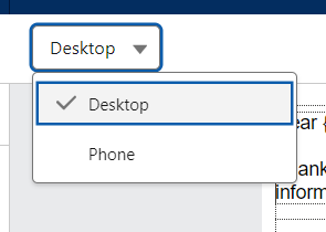
The template builder defaults to a desktop view. You can switch your view to phone to see what the template would look like in a mobile device.
Saving your template
When you are done creating your template, click Save in the top right.

Then click the Back button in the top left to exit the Email Template Builder.

Insert/Preview Your Template
Create or a find a test case, then click compose to start an email.
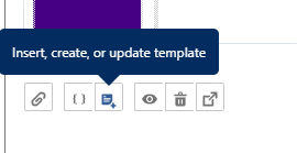
On the bottom left, click the button for Insert, create, or update template.
You will see a list of previously used templates. Select a recently used template or select Insert a template
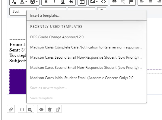
Navigate to your template.
If there’s been previous correspondence, you may receive a warning screen. Just click Insert.

To preview the email, click the eye icon under the editor.
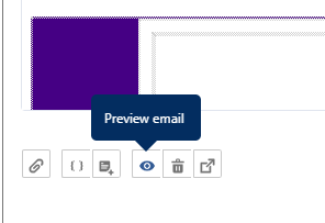
You will see a preview window of how the email will appear to the recipient.
Clone Your Template
Once you’ve created your first email template, you may have many more that you would like to create that use the same elements from an existing template, but just need to change the text. The easiest way to do this is to clone your template.
To do this, open an email template and click Clone in the top right.
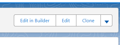
Rename the template to what you would like your new template to be named and change the Subject. Then click save it and click Edit in Builder to add your new content.
Video Training
For additional assistance please review the Email Templates Training Video.

